location: Irvine, CA
size: 45,000 SF HQ
scope: environmental graphics, branding & wayfinding
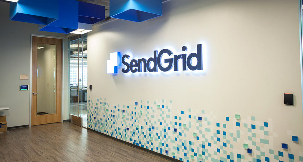
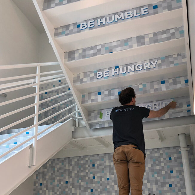
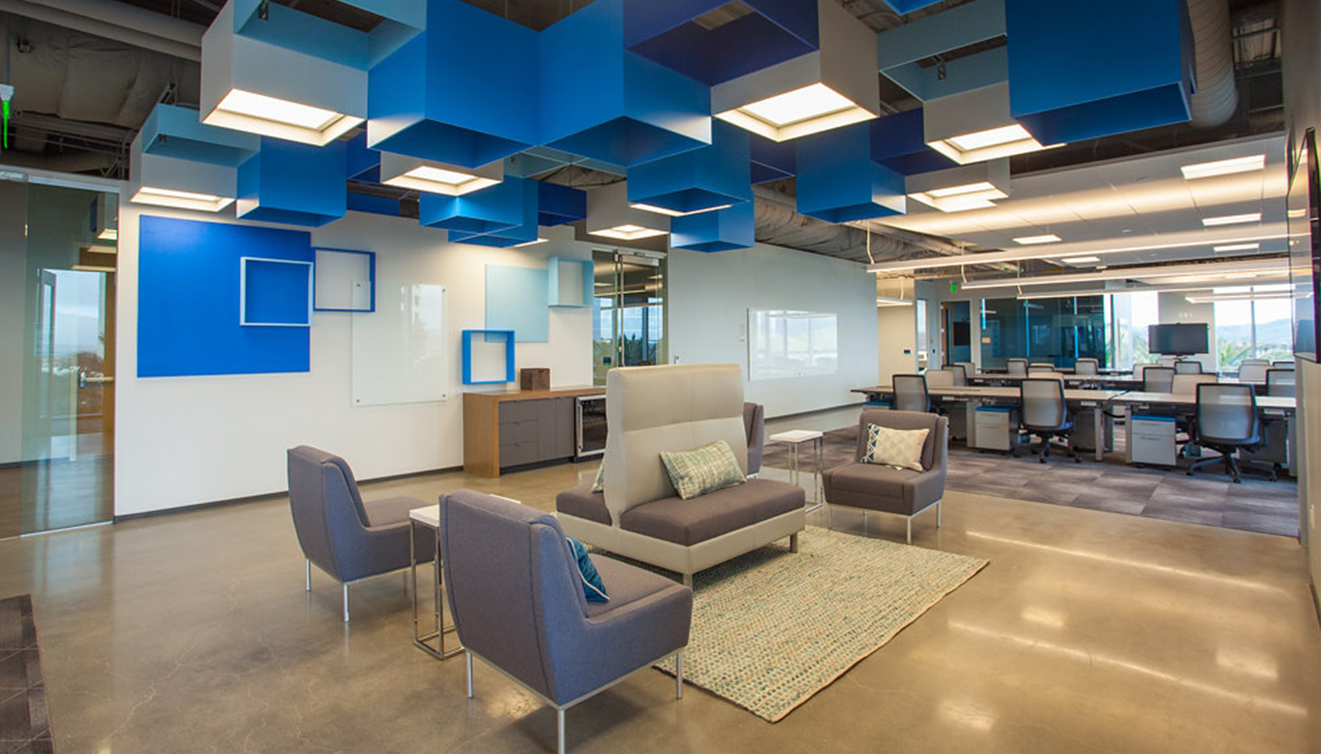
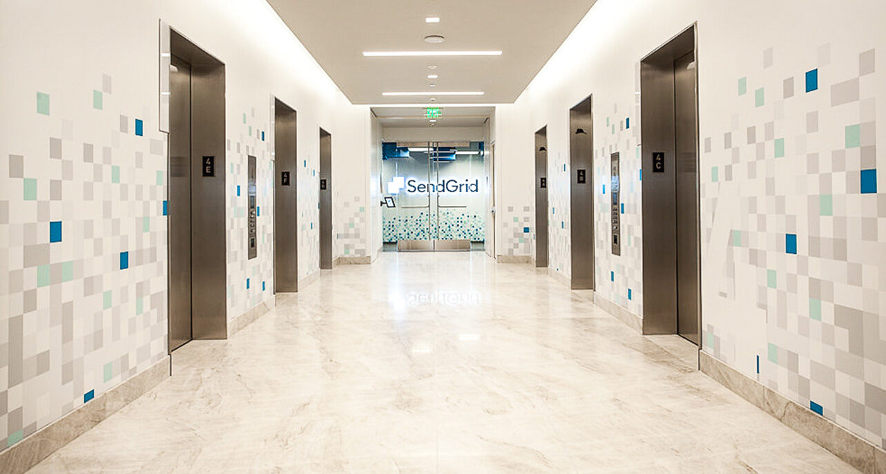
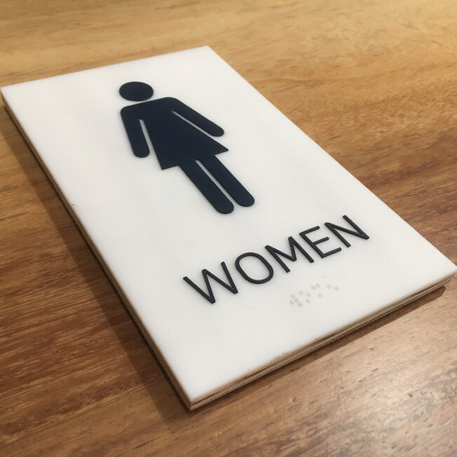
Working in tandem with the SendGrid marketing team, we designed graphics that felt fresh and modern while staying true to the brand and complementing the interior design.
Key brand assets were front and center, like company identifiers ‘The Grid’ and pixelation. To create ‘The Grid’ signage we layered a combination of materials to create an aesthetic indicative of the expansive digital universe the grid represents.
It was a blast investigating project materialities
that were representative of the grid, and then seeing that all that effort come alive.
The SendGrid Brand has so much depth when it comes to design assets and storytelling for us to draw from making this office space cohesive & rich in brand. What I enjoyed most with this project was the exploration of materials and how those brand assets would get translated into the physical space with the most elaborate example of this being the layered “The Grid” letters.
